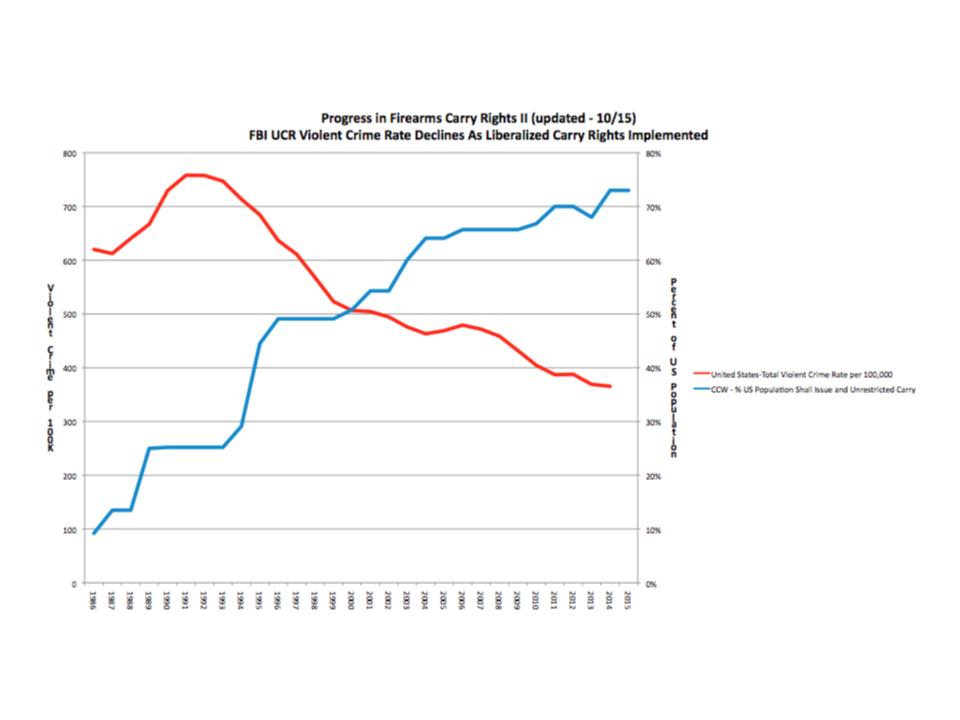
I published Every Picture Tells A Story, Part Three last Wednesday. It was an update of the 2011 post that tracked the spread of firearms freedom as evidenced by the growth in shall-issue and constitutional carry. It was released on October 15th to commemorate the effective date of constitutional carry in the state of Maine.
Also published in 2011 was another collaboration with Rob Vance called Every Picture Tells A Story, Part Two which plotted annual FBI violent crime rates against the growth of shall-issue concealed carry. We explicitly stated back then that there wasn’t a positive correlation between violent crime rates and liberalized carry laws. We also said that proving a negative correlation would take more a more rigorous statistical approach. However, we took note of Linoge’s work regarding the negative correlation between crime involving firearms and gun ownership. I would note that Linoge has updated his work and the negative correlation is even stronger in 2015 (-0.8016) than in 2011.
Rob has updated his graph to reflect the changes since 2011 in both crime rates and the growth of shall-issue and constitutional carry.
When Illinois, the fifth largest state in the US, was forced to adopt shall-issue concealed carry, the anti-rights movement predicted blood in the streets of Chicago and elsewhere in Illinois. That is, more blood than is normal in Chicago with its long history of stringent gun control. The graph above normalizes the crime rates as per 100,000. If shall-issue concealed carry would have caused an increase in crime rates in Illinois, it would have shown up in the graph.
Rob notes this about the graph and what it illustrates:
Every time the citizens of our states manage to convince their legislators that individual self-defense via unrestricted or shall issue concealed carry is the best approach, the press repeats the shibboleth that such laws will result in “blood in the streets.” Well, the press has been wrong about that, and they’ve been wrong repeatedly and over many many years. Then again, newspaper circulation is down and this kind of lazy reporting might be one of the reasons why. Violent crime rates, including the murder rates, are down in the United States from a peak in the early 1990’s, but you wouldn’t know it from our press. The diagram below starts with data gathered to demonstrate the change in state laws in favor of no or de minimis regulation of concealed carry of firearms for self-defense (https://docs.google.com/spreadsheets/d/1QxBfs9acTUH8hL1OtkitcivuCzr4IQKjKOQ4_obK61c/pubhtml), and integrates FBI Uniform Crime Reporting data on the national level of violent crime over time.
Concealed carry laws matter because they change the balance of power in the favor of law abiding citizens over violent criminals, increasing both the real and the perceived risk associated with criminal behavior. Over the last 25 plus years the rate of violent crimes in the US has fallen substantially, and this change runs directly counter to the increasing availability of concealed carry as a self-defense option for Americans. We are now experiencing lowered rates of violent crime last seen in the early 1970s and murder rates from the mid-1960s. As John Lott has written (extensively I might add), “More Guns = Less Crime.” Correlation isn’t causality is a truth from statistics; yet it is entirely truthful to say that the normalization of armed self-defense is taking place in a period when the rate of violent crime is falling in the US. Any other conclusion does not follow the data.
Links to our data sources are below:


For the vision impaired:
The red line is "United States-Total Violent Crime Rate Per 100,000"
The blue line is "CCW-% Population Shall Issue and Unrestricted Carry"
The years are 1986 – 2015 (left to right)
The left margin is something something per 100K.
The right margin is Percent US Population.
I've updated the graphic with a clearer one.
There may be an error in the 2013 data point for percent of population. Shouldn't the number go up, instead of down, in that year?
Get Free Cricket betting tips at cricket betting tips free in with all the accurate cricket betting tips report for free with free trial and also we provide.
click on link of my blog and get car care tips