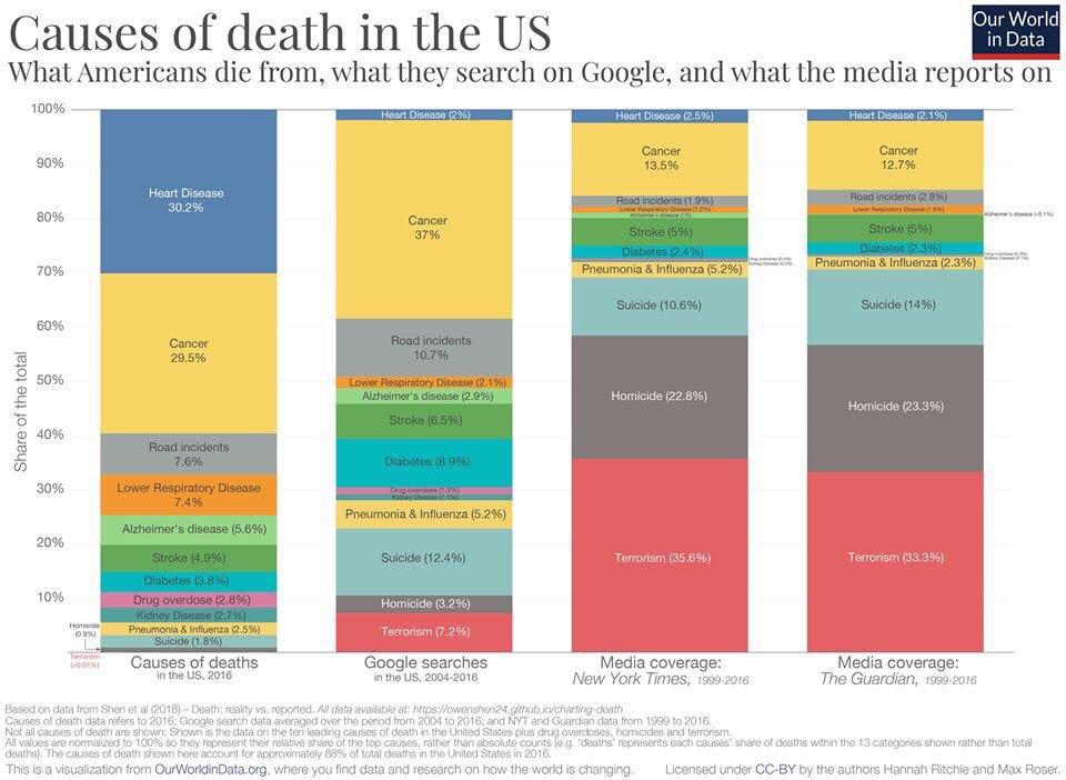
I came across a very interesting infographic that compares actual causes of death, what people find in Google searches, and how the media treats the various causes of death. The media was represented by examining coverage in the New York Times and the UK’s Guardian for the period 1999 to 2016.
If you only relied upon the media, you would believe that over 50% of deaths were the result of either terrorism or homicide and that very few were due to heart disease. The reality is that heart disease followed by cancer are the first and second causes of death in the US. Moreover, the two combine to account for almost 60% of deaths.
This comes from OurWorldInData and you can get the data behind these charts here. You can read more analysis of the data here.

