
As they used to say on Monty Python, “And now for something totally different.”
If you have followed this blog over the years, you know I love a good infographic. Presenting data graphically makes it more accessible and more readily understandable.
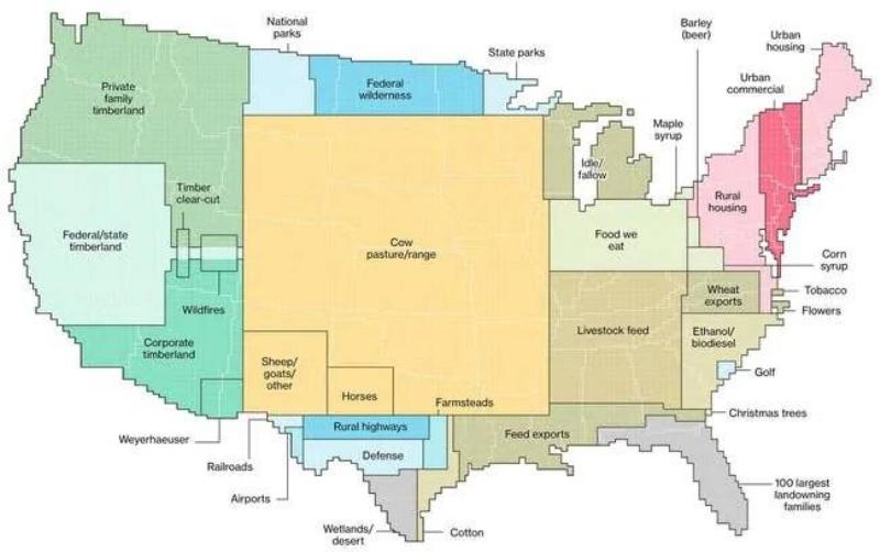
I came across this infographic on land use in the United States. It divides a map of the US up into sections based upon land use. Pasturage for cows is the number one land use in America. Obviously, we like our beef and we like our dairy products.
I’m not sure where I found it but it seems to have originated with an article on Bloomberg from 2018.
Yep, there are some ‘interesting’ maps out there, if one digs enough…
I am not sure where the line gets drawn between desert, cow grazing and timberlands. Anybody from the interior west can tell you there is a lot more desert than shows on the map. Uses are ambiguous. There are huge areas of pinyon/juniper woodlands. Not really much good for timber other than firewood. Cows graze there and it is desert-like. Some of it is in national parks too. Cows graze, sparsely, in the desert.
This is why I hate graphics. Especially ones from Bloomberg which are undoubtedly trying to make a political point When I was doing this for a living, I always assumed that someone giving me a graph was deceiving me and asked to see the charts and the detail behind them.
The agenda being pushed is obvious when you notice “Food we eat” is being listed separate from everything cattle, as well as plotting corporate holdings and “top 100 landowning families” in a convenient analogy as the size of Florida, separately from everything else… When in actuality many of these separate things actually overlap many other sections.
“Oh, well this is a simplification, and overlaps would add unneeded complexity.”
Really? Then why show overlaps around wildfires?
As long as we get to expropriate Bloomberg first. Fire overlap comment is right on. I have been monitoring fires both for my travel purposes and to try to figure out whether leftists are actually setting fires. There is a wonderful source called the National Interagency Fire Center that provides incident reports for every fire. Two gems I have gotten out this. First, media hysteria not withstanding, this is a slightly above average fire year. 4 of the last 10 were worse. Second, the cause of most of the fires has not been determined. Can’t get the forensics guys in there until the fire is out plus they tend to get drafted to work the fire lines. So the FBI was just making stuff up when they said it wasn’t happening because there is no way they could know the answer. Leftists have been arrested for setting some little fires in stupid places like freeway medians but no word on big fires that I can find.
In the cow/pasture/range there is a shitload of wheat and corn and soybeans being grown (among a lot of other crops). It seems the “food we eat” category is a bit misplaced.
I call crap on this map. Bloomberg does not have a clue.